

We worked with Larne FC for 8 years to develop their accessible infrastructure, training and online content. With enhanced accessibility, the club has been able to welcome many more disabled supporters, and to show a proactive approach with access.
Larne Football Club
Our Projects
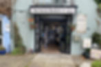
The Secret Bookshelf
The Secret Bookshelf came to us for guidance on accessibility for their first ever book festival. We undertook extensive research and site visits to compile an access guide, including transport links, what to expect and a guide to each of the venues used.
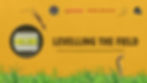
Levelling the Field was our first experience of working at a major UK music festival - Mighty Hoopla, London. We worked in production, and supported with on the spot access changes needed, giving guidance to the organisers for future festival access.